
 Inksky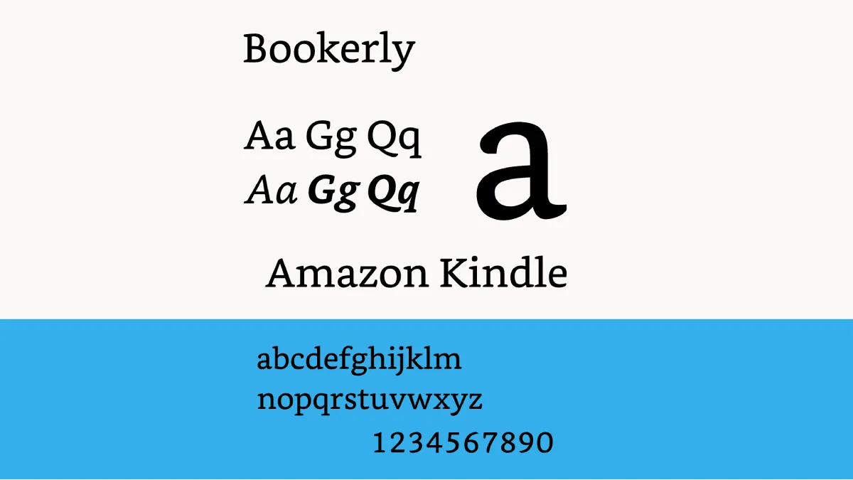
I used to think Kindle’s reading settings were something you set once and forgot. Then I got a Paperwhite with warm light and realized I’d been reading wrong for years. Dialing in the right combination of font, size, boldness, and warmth genuinely changes how long you can read comfortably.
The font selection is solid out of the box. Bookerly is my default — it was designed by Amazon specifically for long-form reading and it shows. The letterforms are wider and more open than typical serif fonts, which matters on e-ink where contrast is lower than print. Amazon Ember is a clean alternative if you prefer sans-serif, and OpenDyslexic is available for readers who benefit from its weighted bottoms. But the ones I actually switch between are Bookerly for fiction and Ember for nonfiction and articles.
Font size and boldness are the settings that surprised me most. Everyone cranks the size up, but boldness is the secret weapon. Most people read at size 4-5 with boldness at level 1, and that’s comfortable. But if you’re reading in dim light or at the end of a long day, bumping boldness to level 2 makes text feel sharper without making it bigger. For seniors or anyone with vision issues, boldness at 3 with a larger font size is transformative. My dad went from “I can’t read on screens” to reading an hour a night with size 10 and boldness 3.
Page layout matters more than people admit. I keep margins narrow — why waste screen space? Line spacing at medium feels natural; wide spacing makes it harder to track lines. Alignment should be left, not justified, for the same reason. Landscape orientation is worth trying if you hold your Kindle with both hands or use a stand.
Warm light is the feature I’d pay extra for every time. I set mine to gradually warm starting at 8 PM and max out by bedtime. Combined with dark mode (white text on black), it’s the closest thing to reading a physical book under a warm lamp. You can schedule it automatically, which is nice, but I adjust manually depending on the room. Bright sunlight calls for size 6, boldness 2, zero warmth, and brightness at zero — the e-ink reflects ambient light beautifully.
Take five minutes to experiment. The settings that feel right at 10 AM in a coffee shop won’t feel right at 11 PM in bed. Once you find your sweet spots, you’ll wonder why you ever tolerated the defaults.