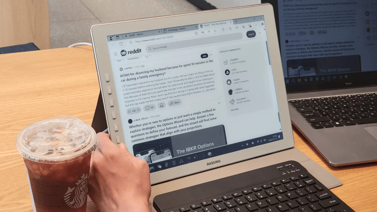
Last week I went all-in on E Ink. The main monitor on my desk was replaced with a 25.3-inch Dasung Paperlike, and I wrote code, read documentation, and managed Jira tickets entirely in grayscale. Here’s what happened.
Available Models: More Than Just Dasung
Before diving into the experience, let’s cover the landscape. The E Ink monitor market is small but growing, and there are now several credible options:
Dasung Paperlike Series — The most established player. Dasung offers the Paperlike in three sizes: 13.3” ($699), 25.3” ($1,799), and a color variant (25.3” with E Ink Kaleido 3, around $2,000+). The 13.3” is portable and USB-C powered; the 25.3” is a full desktop monitor replacement. All models support Turbo mode (40 Hz) and standard mode (15 Hz). The Paperlike HD (13.3”, 2200×1650) is the most popular model among developers.
Onyx Boox Mira — Onyx entered the monitor space with the Mira (13.3”, ~$799) and Mira Pro (25.3”, ~$1,799). The Mira uses the same E Ink panel as the Dasung but adds Onyx’s software layer, which includes more granular refresh mode controls, contrast and sharpness sliders, and a moon light front light on both sizes. The Mira Pro’s front light is genuinely useful for working in dim rooms. Onyx’s firmware updates have been more frequent than Dasung’s, and the Mira’s build quality (aluminum unibody) feels slightly more premium.
Dasung Paperlike Color — The newest entry, using E Ink Kaleido 3 for 4,096 colors at 150 PPI (vs 300 PPI for the grayscale layer). Color refreshes are slower and the resolution is halved, but having red error underlines and green success indicators back is compelling. At over $2,000 it’s a tough sell unless color is genuinely critical.
For this review, I used the Dasung Paperlike 253 (25.3”, grayscale) as my primary monitor for one full workweek.
Specs at a Glance
| Feature | Dasung Paperlike 13.3 | Dasung Paperlike 253 | Onyx Boox Mira Pro |
|---|---|---|---|
| Screen | 13.3” E Ink | 25.3” E Ink | 25.3” E Ink |
| Resolution | 2200×1650 | 3200×1800 | 3200×1800 |
| Refresh Modes | 15 Hz / 40 Hz Turbo | 15 Hz / 40 Hz Turbo | Multiple presets |
| Front Light | No | No | Yes (warm + cold) |
| Connectivity | USB-C, HDMI | USB-C, HDMI, DP | USB-C, HDMI |
| Weight | ~600g | ~2.8kg | ~2.7kg |
| Price | $699 | $1,799 | ~$1,799 |
Day-by-Day Breakdown
Day 1 (Monday) — Setup and First Impressions
Unboxing the 25.3” Dasung felt absurd. An E Ink display this large looks like a prop from a sci-fi film. Setup was straightforward — HDMI into my MacBook, USB-C for power (the monitor draws power over USB-C even when using HDMI for video), and macOS recognized it as a standard display. No drivers needed on macOS; Windows users should install Dasung’s driver for the Turbo mode toggle.
The first hour was disorienting. My brain expected an LCD and got paper. I kept waiting for the screen to “wake up” or get brighter. The default mode (15 Hz) made moving the cursor feel like dragging it through molasses. Switching to Turbo mode (40 Hz) made a big difference — still not fluid, but usable.
By 3pm I noticed I hadn’t needed eye drops. Normally by that time I’m reaching for them. I wrote code in VS Code with the grayscale theme, read a 40-page API specification, and responded to Slack messages. The Slack experience was surprisingly fine — text-based communication works perfectly on E Ink.
Day 2 (Tuesday) — Finding the Workflow
Today I configured my development environment around the monitor’s strengths and weaknesses. I applied a high-contrast grayscale theme in VS Code (using the “Gray Matter” theme with increased contrast settings). I disabled smooth scrolling everywhere — VS Code, Chrome, terminal. I set all fonts one size larger than usual. On E Ink, tiny monospace text at 12px becomes hard to read because of the lower contrast ratio; bumping to 14-15px made a significant difference.
I spent the morning coding a REST API endpoint and the afternoon reviewing three long-form pull requests. The pull request review experience was outstanding. Reading code on E Ink feels like reading a printed code listing — your eyes move naturally through the logic without the subconscious tension that comes from actively-lit screens. I caught a logic bug I might have skimmed past on LCD.
Day 3 (Wednesday) — The Wall
Midweek fatigue is normal with any monitor switch, but today the E Ink limitations bit hard. I needed to review a design mockup in Figma and it was functionally impossible. Everything was gray. Button states were indistinguishable. I also had to debug a visual regression involving CSS colors, and there was simply no way to do it on the E Ink display. I pulled out my MacBook screen for those tasks.
Cursor lag in standard mode also became frustrating during a session of heavy terminal work — moving between tmux panes, resizing splits, and scrolling through logs. Turbo mode helped but introduced more ghosting. The tradeoff between ghosting and responsiveness is constant on E Ink.
Day 4 (Thursday) — Settling In
By Thursday I’d established a rhythm. The Dasung stayed as my main display for everything text-based: VS Code, terminal, browser (documentation, articles, email), Slack, and Obsidian. For anything involving color — Figma, GitHub’s diff view with colored lines, terminal output with ANSI colors — I used my MacBook’s screen. This dual-screen setup felt natural and I wished I’d adopted it from day one.
I wrote a 3,000-word technical document entirely on the E Ink monitor. The experience was remarkable — my focus stayed locked, no impulse to switch tabs, no eye fatigue after two hours of continuous writing. There’s something about text on E Ink that signals to your brain that this is a reading surface, not a multitasking surface.
Day 5 (Friday) — Assessment
I started the day reading a 60-page RFC and finished it in one sitting. On an LCD I would have taken breaks, skimmed sections, or opened another tab. The reading comprehension difference is real. I retained more and finished faster.
But I also missed color. A lot. Code reviews without colored diffs are functional but slower. Terminal warnings, errors, and success messages all look the same. I found myself running git diff on the LCD screen and moving back to E Ink for the actual reading.
E Ink vs LCD: Task-by-Task Comparison
| Task | E Ink Experience | LCD Experience | Winner |
|---|---|---|---|
| Writing code | Excellent once theme is configured. Focus stays locked. | Fine, but eye fatigue builds after 3-4 hours. | E Ink (for sessions over 2 hours) |
| Reading documentation | Outstanding. Feels like reading a book. No scrolling fatigue. | Passable but screen glare and brightness cause micro-breaks in attention. | E Ink (by a wide margin) |
| Code review | Good for logic review. Bad for visual/color diffs. | Good for everything. Color-coded diffs are faster to scan. | LCD (for speed), E Ink (for depth) |
| Terminal work | Functional with grayscale theme. tmux pane borders are hard to distinguish. | Seamless. Color output is informative. | LCD |
| Figma / design review | Unusable. Everything is gray. | Works as intended. | LCD |
| Writing / documentation | Outstanding. No distractions, comfortable for long sessions. | Fine, but more likely to lose focus. | E Ink |
| Email / Slack | Perfect. Text communication needs nothing more. | Same, but with more eye strain over time. | Tie (E Ink for comfort) |
| Web browsing | Works for text-heavy sites. Image-heavy or interactive sites struggle with refresh rate. | Works for everything. | LCD |
Settings Optimization Tips
Getting the most out of an E Ink monitor requires some configuration. Here’s what I settled on after a week of tuning:
-
Disable smooth scrolling everywhere. In macOS, go to System Settings → Accessibility → Pointer Control and disable “Inertia.” In Firefox/Chrome, set
general.smoothScrollto false. Smooth scrolling on a 15-40 Hz display creates ghosting trails that make text unreadable during movement. -
Use a high-contrast grayscale theme in your code editor. Dark themes that rely on color for syntax differentiation become a uniform gray blob. Light themes with bold font weights for keywords work better. I recommend “Gray Matter” or a custom high-contrast monochrome setup with clear weight distinctions between tokens.
-
Increase font size by 1-2 points. E Ink contrast is lower than LCD. Text at 12px that’s readable on a Retina display becomes muddy on E Ink. 14-15px for code and 16-18px for prose is the sweet spot.
-
Disable animations in your OS. Reduce motion in macOS accessibility settings, disable window animation effects, and turn off transition effects in your terminal emulator. Every animation triggers a full or partial screen refresh.
-
Use Turbo mode (40 Hz) for active work, standard mode (15 Hz) for reading. Switching is a single button press on both Dasung and Mira monitors. I kept Turbo on during coding sessions and switched to standard for documentation reading — the slower mode produces less ghosting and a cleaner image.
-
Position lighting carefully. E Ink is reflective, not emissive. You want a desk lamp positioned to illuminate the screen without creating glare. The Onyx Mira’s built-in front light solves this problem elegantly; Dasung users need to manage ambient lighting.
Who Should Buy an E Ink Monitor
- Developers who read documentation for hours. If your job involves digesting RFCs, API specs, or technical books, an E Ink monitor will reduce eye strain dramatically and improve reading comprehension.
- Writers and researchers. Anyone producing long-form text benefits from the distraction-free, eye-comfortable environment. Academic writers, journalists, and technical authors are ideal candidates.
- People with chronic eye strain or light sensitivity. If you’ve tried blue-light glasses, dark mode, lower brightness, and still get headaches by 3pm, E Ink addresses the root cause: the backlight itself.
- Secondary monitor users. As a second display dedicated to reading and reference material, an E Ink monitor complements an LCD setup perfectly. It’s the ideal use case.
Who Should Not Buy an E Ink Monitor
- Frontend developers or designers. If your work involves color accuracy, CSS styling, or visual design tools, E Ink will frustrate you constantly. Color E Ink exists but at lower resolution and higher price — and it’s still not color-accurate.
- Gamers. The 15-40 Hz refresh rate is a non-starter. Don’t even consider it.
- Single-monitor users on a budget. At $699-$1,799, an E Ink monitor costs as much as a high-end LCD. If you can only afford one display, make it a good color LCD. E Ink is a specialist tool, not a general-purpose replacement.
- Anyone who can’t tolerate cursor lag. Even in Turbo mode, there’s perceptible delay between input and response. If that drives you crazy, E Ink isn’t for you yet.
The Verdict
For a primary developer monitor, E Ink isn’t ready. Color is too important and refresh rates are too slow. But as a secondary display for reading documentation, writing prose, or reviewing pull requests, it’s a productivity superpower. I’m keeping the Dasung on my desk as my “reading screen” alongside a normal LCD for coding. My eyes have never felt better at the end of a workday.
The ideal setup is the one I landed on: a color LCD as the primary coding display and an E Ink monitor on the side for documentation, long-form reading, and focused writing. At that job, E Ink is unmatched. The question isn’t whether E Ink monitors are the future of computing — they’re not. The question is whether they solve a specific problem for a specific kind of worker. For the reading-heavy developer or writer, the answer is an emphatic yes.