I used to think Kindle’s reading settings were something you set once and forgot. Then I got a Paperwhite with warm light and realized I’d been reading wrong for years. Dialing in the right combination of font, size, boldness, and warmth genuinely changes how long you can read comfortably.
Built-in fonts: what each is best for
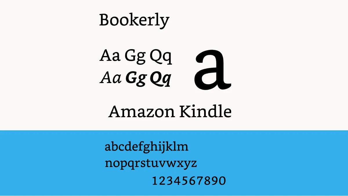
Kindle ships with a carefully curated set of typefaces, and each one serves a distinct reading scenario. Bookerly is the default for good reason — Amazon commissioned it specifically for e-ink displays. Its slightly wider letterforms and generous x-height maintain legibility even when the contrast drops in dim lighting. Bookerly excels for long-form fiction where immersion matters more than information density.
Amazon Ember is the sans-serif counterpart, with clean geometric lines that feel modern and uncluttered. It works well for nonfiction, technical books, and articles where you’re scanning for information rather than settling into a narrative. The lack of serifs makes headings and lists stand out clearly.
Palatino is an old favorite borrowed from the print world. Its elegant, classical proportions bring a literary feel to historical fiction and essays. Some readers find it slightly less crisp than Bookerly on lower-resolution screens, but on 300 PPI Paperwhites it renders beautifully.
Baskerville and Caecilia are the transitional serifs in the lineup. Baskerville leans traditional — it’s the font you’d expect in a hardcover classic. Caecilia is a slab serif with a bit more weight, originally Kindle’s default before Bookerly arrived. It holds up well for readers who want serif structure with added boldness baked into the letterforms.
Helvetica is the utilitarian choice. It’s not designed for extended reading, but its familiarity makes it comfortable for short sessions, reference material, and anyone who simply prefers a neutral, distraction-free appearance.
OpenDyslexic deserves special mention. Its bottom-heavy letterforms and wider character spacing reduce letter-swapping confusion for readers with dyslexia. Even if you don’t have a formal diagnosis, you might find OpenDyslexic reduces eye strain if you’ve ever felt letters “swimming” on the page. It’s available on every modern Kindle with no extra setup.
Installing custom fonts
Kindle supports sideloaded TrueType (.ttf) and OpenType (.otf) fonts, which opens up an entire world of typography. The process is straightforward:
- Connect your Kindle to a computer via USB
- Open the Kindle drive and create a folder called
fontsat the root level (if it doesn’t already exist) - Copy your font files into that folder — you typically need Regular, Italic, Bold, and BoldItalic variants for full styling support
- Eject and restart the Kindle
- The custom font appears in the Font menu under the name embedded in the font file
Some popular custom choices include Atkinson Hyperlegible from the Braille Institute — designed for maximum character distinction, Literata by Google (commissioned for Play Books with e-reading in mind), and ChareInk from the MobileRead community, which trades some elegance for maximum contrast and readability. If you install a font and it shows as blank or garbled, the file likely has licensing restrictions. Stick to openly licensed fonts or fonts you’ve purchased with embedding rights.
Font size, boldness, and the secret weapon
Font size and boldness are the settings that surprised me most. Everyone cranks the size up, but boldness is the secret weapon. Most people read at size 4–5 with boldness at level 1, and that’s comfortable. But if you’re reading in dim light or at the end of a long day, bumping boldness to level 2 makes text feel sharper without making it bigger. For seniors or anyone with vision issues, boldness at 3 with a larger font size is transformative. My dad went from “I can’t read on screens” to reading an hour a night with size 10 and boldness 3.
The size scale goes from 1 to 14, and where you land depends on your eyesight and reading distance. Size 1–3 suits readers with excellent near vision who hold the Kindle close. Size 4–6 is the sweet spot for most adults at arm’s length. Size 7 and above transitions into large-print territory — if you’ve ever wished paperbacks came in bigger type, the Kindle gives you that instantly.
Line spacing, margins, and alignment
Page layout matters more than people admit. I keep margins narrow — why waste screen space on a 6-inch display? The Kindle offers three margin presets, and the narrowest option recovers roughly 15% more text per page compared to the widest. That might not sound like much, but over a 300-page book it means significantly fewer page turns.
Line spacing runs on a three-level scale. Tight spacing packs more text per screen, which is useful for fast readers who don’t want constant page turns breaking their flow. Medium spacing is the Goldilocks option for most people. Wide spacing creates more white space between lines, which some readers find reduces visual crowding — but it also means fewer words per screen and more frequent page turns, which can paradoxically increase fatigue.
Alignment should be left, not justified, for the same reason. Justified text on a small screen creates uneven word spacing and rivers of white space running through paragraphs. Left-aligned text maintains consistent spacing and is easier for your eyes to track, especially if you have any degree of astigmatism or visual processing difficulty.
Warm light and dark mode
Warm light is the feature I’d pay extra for every time. I set mine to gradually warm starting at 8 PM and max out by bedtime. Combined with dark mode (white text on black), it’s the closest thing to reading a physical book under a warm lamp. You can schedule it automatically, which is nice, but I adjust manually depending on the room.
Bright sunlight calls for size 6, boldness 2, zero warmth, and brightness at zero — the e-ink reflects ambient light beautifully. Dim evening calls for warm light at 18–20, dark mode on, and a slightly larger font because pupil dilation reduces acuity. The Kindle’s front light is directional (it shines across the screen, not into your eyes), so even at maximum brightness it’s less straining than a phone or tablet.
How fonts affect reading speed and eye strain
Typography isn’t just aesthetics — it measurably affects how fast you read and how long you can sustain attention. Serif fonts like Bookerly and Palatino guide the eye horizontally through letter connections, which tends to improve speed for long-form continuous text. Sans-serif fonts, by contrast, emphasize individual characters, making them better for scanning and reference material.
Studies on e-reading consistently show that increasing font size reduces eye strain more than any other single adjustment. The reason is simple: small text forces your eyes to work harder to resolve letter shapes, especially on e-ink where contrast is lower than print. If you find yourself squinting or leaning in, go up one font size. Counterintuitively, bigger text often increases reading speed because your eyes spend less effort decoding each word and more effort parsing meaning.
Boldness adjustments help with contrast sensitivity, which declines with age. Even if your prescription is current, mid-to-low contrast text on e-ink can feel washed out. Adding one level of boldness restores the crispness without making the text feel heavy. For readers over 50, boldness 2 or 3 is worth trying even if it looks too dark at first — your eyes adapt within a few pages, and the reading comfort difference is substantial.
Take five minutes to experiment. The settings that feel right at 10 AM in a coffee shop won’t feel right at 11 PM in bed. Once you find your sweet spots, you’ll wonder why you ever tolerated the defaults.