 Inksky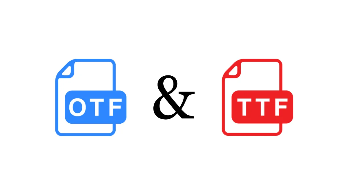
Reading with dyslexia on a traditional book is hard enough: letters that seem to shift on the page, words that blur together, lines that get lost mid-sentence. E-readers, somewhat unexpectedly, are one of the best tools available for dyslexic readers — and they have been for years. The ability to change font, size, spacing, and margins on the fly means you can tune the reading experience to exactly what works for your brain, and switch settings as needed depending on how tired or focused you feel.
But finding the right settings is not obvious, and most e-readers ship with default typography that is not optimized for accessibility. This guide covers what actually helps, based on the current research and real feedback from dyslexic readers.
Why E-Readers Help
Three things make e-readers uniquely suited to dyslexic readers:
- Font choice: You are not stuck with the publisher’s typesetting. You can switch to a font designed for readability at any time.
- Adjustable spacing: Line height, margins, and word spacing are all customizable, and wider spacing demonstrably improves reading speed for many dyslexic readers.
- Consistent layout: Unlike a website or a PDF with reflowing text, an e-reader presents text in a fixed, predictable layout that reduces visual distraction.
Several studies, including a 2013 Smithsonian study and follow-up research, have found that dyslexic readers show improved reading speed and comprehension on e-readers when using short line lengths and increased spacing compared to printed text.
The Best Fonts for Dyslexic Readers
OpenDyslexic (free, built into Kobo)
OpenDyslexic is the most well-known dyslexia-friendly font. Its letters have heavier bottoms that create a visual “gravity” intended to prevent letters from flipping or swapping. Kobo ships it as a built-in option in the font menu. On Kindle, you need to sideload it via USB. On Boox, you can install it as a system font or through a reading app.
Does it work? The scientific evidence is not conclusive. Some dyslexic readers love it, others find it distracting or ugly. The value of OpenDyslexic is not that it is universally effective, but that it provides an option that standard fonts do not. Try it for a week and see.
Atkinson Hyperlegible (free, all devices)
Developed by the Braille Institute, Atkinson Hyperlegible was designed specifically for low-vision readers but works extremely well for dyslexia too. Its key feature: letters are shaped to be maximally distinct from each other. The capital I, lowercase l, and number 1 look unmistakably different. The letterforms have exaggerated openings and unambiguous shapes that reduce confusion between similar characters.
Atkinson Hyperlegible is free to download and sideload onto any e-reader. It is the single best font to try first if you are exploring accessibility options. Many non-dyslexic readers also prefer it simply because it is so clear.
Lexend (free, all devices)
Lexend is a variable font family designed with the specific goal of improving reading fluency. It was developed through research with K-12 students and has a growing body of evidence behind it. Lexend comes in several widths (Deca, Exa, Giga, etc.) that let you adjust the spacing without changing the font size. Wider variants (Lexend Giga) provide more breathing room between letters, which some dyslexic readers find helpful.
Dyslexie (paid, all devices)
Dyslexie is a commercial dyslexia font developed by Christian Boer, a graphic designer with dyslexia. It is similar in concept to OpenDyslexic but with more refined letterforms and a larger character set. The paid version includes multiple weights and is widely used in European schools. If OpenDyslexic does not work for you, Dyslexie is worth the modest license fee.
How to Install Custom Fonts on Each Device
Kindle: Connect via USB. Create a folder called fonts in the Kindle root directory. Copy your TTF or OTF font files into it. Eject and the fonts appear in Aa menu → Font → Custom. Note: bold and italic variants need to be in the same font family file or provided as separate files.
Kobo: Connect via USB. Create a folder called fonts in the Kobo root directory. Fonts appear immediately in the reading menu. Kobo is more permissive than Kindle about font formats and handles variable fonts better.
Boox: Settings → Display → Font. Or install a font manager app from the Play Store. Boox also lets you install fonts system-wide so they work in every app, not just the built-in reader.
Beyond Fonts: Settings That Matter More
Font choice gets all the attention, but spacing settings often matter more for dyslexic readers than which font you pick. On any e-reader, try:
- Line spacing: Set to the widest or second-widest option. Crowded lines make it harder to track from one line to the next.
- Margins: Wider margins reduce the number of words per line, which helps with tracking. Shorter lines (8-12 words) are easier for many dyslexic readers to follow.
- Font size: Go bigger than you think you need. Larger text reduces crowding effects and makes individual letters more distinct.
- Alignment: Left-aligned (ragged right) text is easier to track than justified text, which creates uneven word spacing. Most e-readers default to justified, so change this if your device allows it.
Dark mode or inverted text (white text on black background) helps some dyslexic readers, though the evidence is anecdotal. Try it and see.
The beauty of e-readers is that none of these settings are permanent. You can try a new font and spacing combination every day until you find what clicks. The device you already own is almost certainly capable of being a better reading tool for dyslexia than any printed book ever was — you just need to configure it right.